Personal Websites 02/15/2026
--------------------------------------------------------------------------------
So creative, I know. A blog post on my personal website about personal websites.
I promise though, this is a real post. I've been tweaking the format of this
site because I feel like it's strayed too far from the minimalism I was going
for in the beginning. (just look at it -- doesn't it all feel a bit cluttered?
maybe it's just me. but either way, it needs a change.)
Stylistic Changes
-----------------
So far, I have a few different designs in the works. Mostly inspired by sites
I've found while poking around Dead Simple Sites, Neocities, and random Reddit
posts about minimal websites.
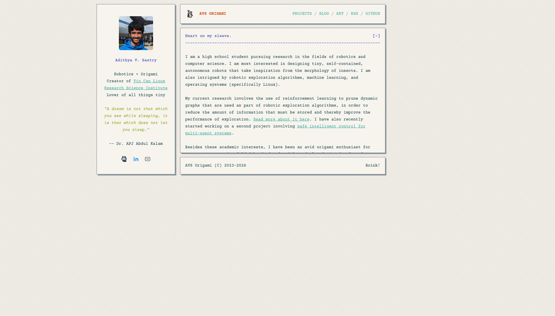
My first thought was that I needed to ditch the fancy round corners and
subtle shadows for something more boxy that sticks out. So I came up with this.
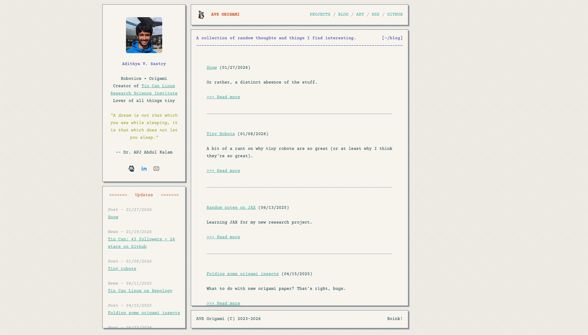
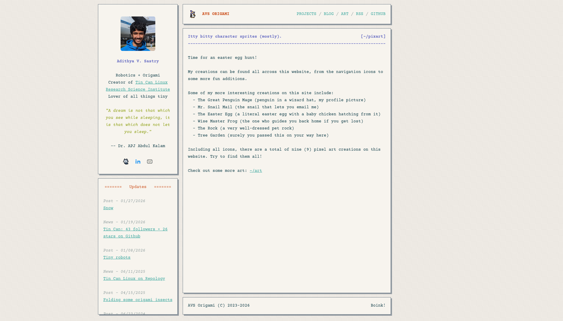
 It looks a little weird on pages without much content, like the pixel art page
and some of the easter eggs. Either there's a bunch of white space, or the
columns are different heights.

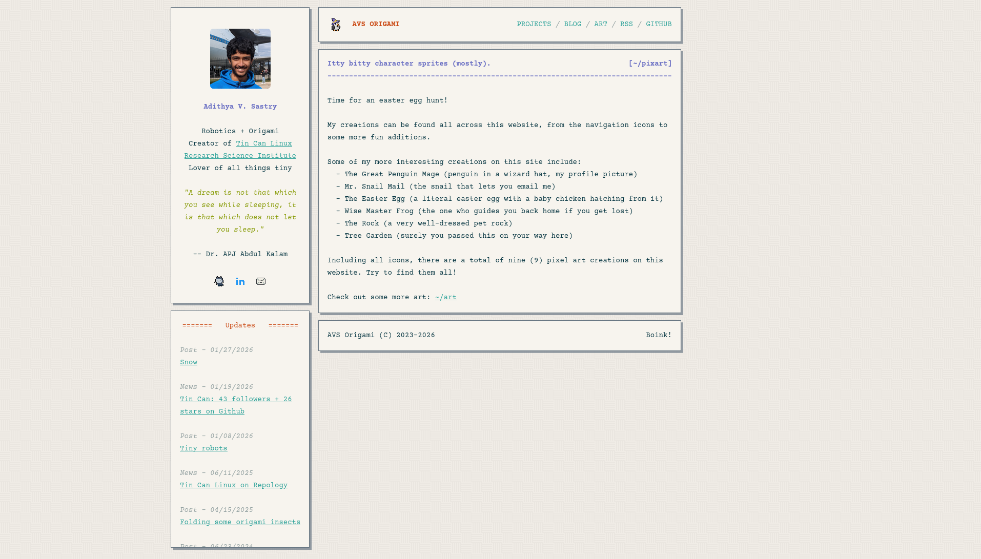
 I also felt weird having the updates section on the left, and eventually decided
keeping an updates section was contributing to the clutter. So I ditched it
completely and tried to set the whole thing to a fixed box region, like on some
older or retro-style websites.
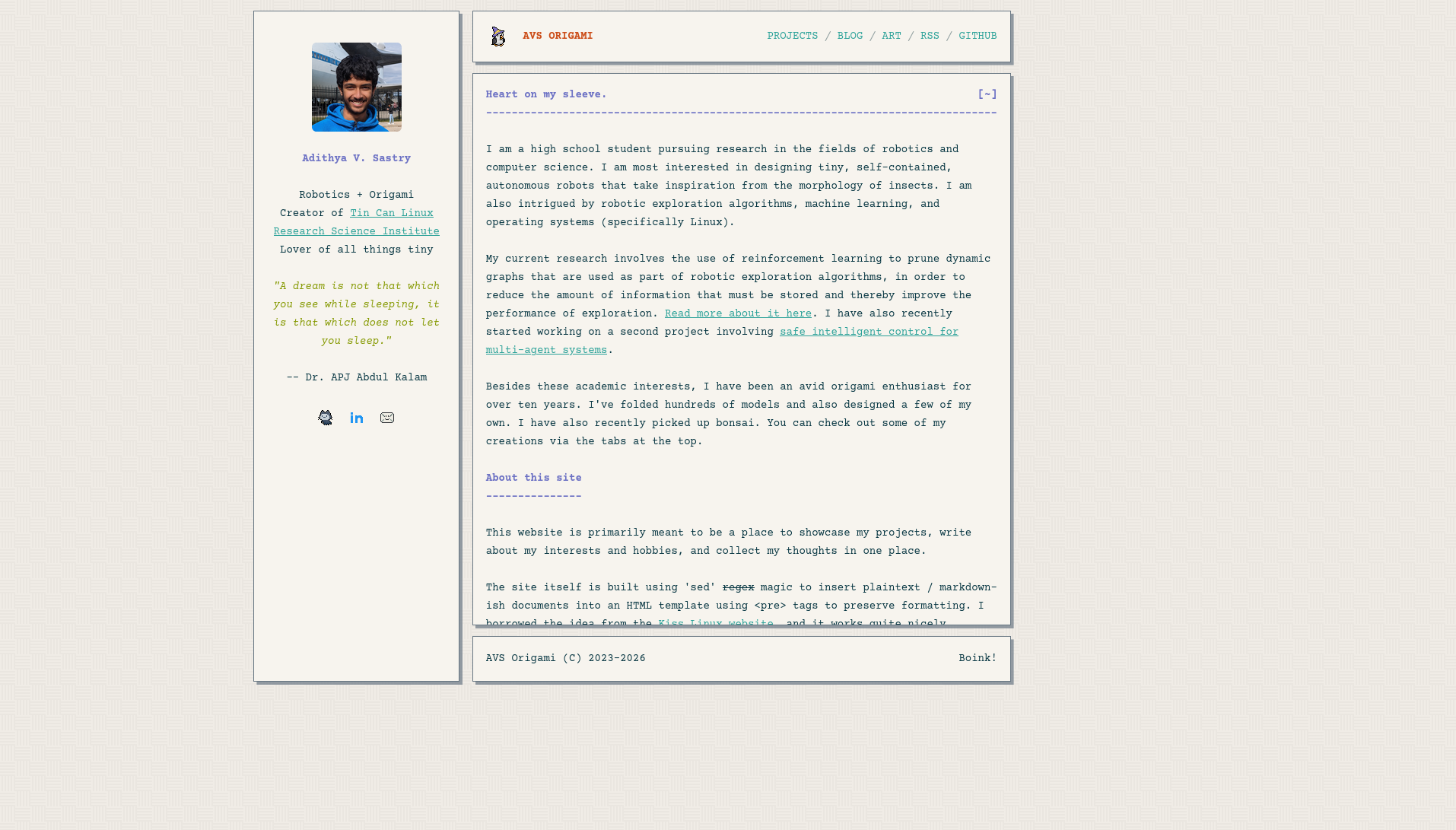
 I need to move the whole thing down a bit though, and I also need to find a way
to vertically center the left column content. Otherwise, if I were to size the
body section to the left column's natural height, the body is much too short for
my liking.
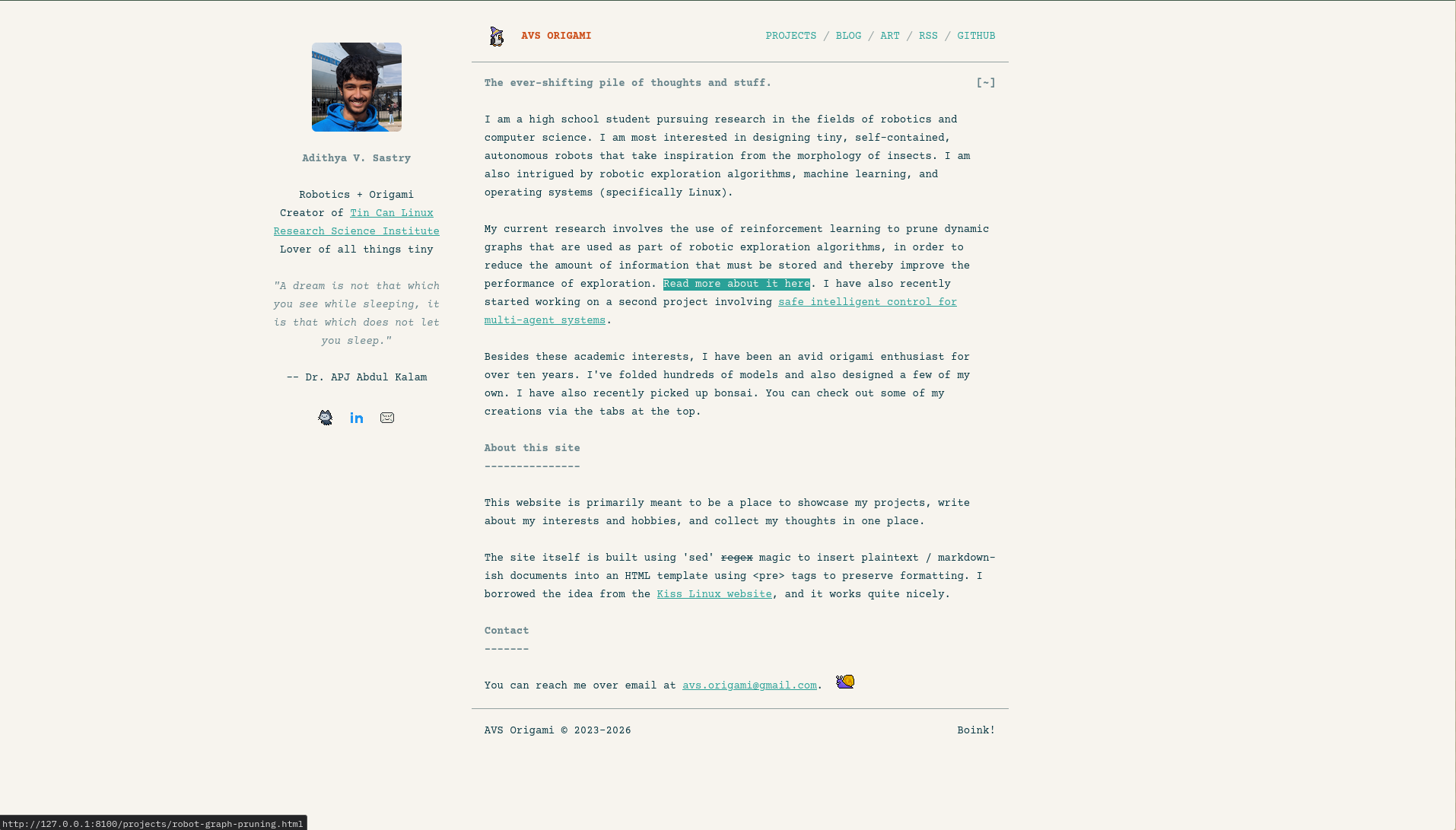
 Then at some point, I thought it's just better to keep it really simple. Like
the style of the Tin Can Linux website. So I stripped out the boxes, and the
tiling pattern background, and muted the colors for bold and italic font. I also
added a style for hovering over a link, which is probably much nicer visually
than what I have now.
 Something looks a bit off though. Can't tell what exactly. But I'm leaning
towards taking some of the styles from this version and merging it with the box
layout of the previous version.
I could also come up with something completely different, so keep an eye out!
Technical changes
-----------------
Beyond the website style itself though, I've made more technical changes to keep
the website actually lightweight -- in the sense of loading faster and
downloading less stuff every time you click on a new page. These have actually
been brought over to the version of the website you're looking at now.
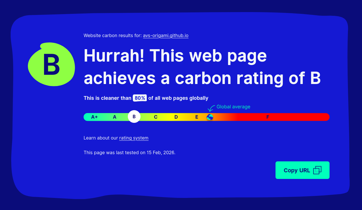
I'm using WebsiteCarbon as the metric for how lightweight my website is. Before
messig with anything, it was sitting at a solid 80%.
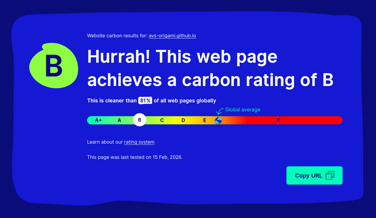
 I've added highlight.js to this site to colorize code blocks. I originally had
pulled it from cdnjs, but that pulls in more than I need. After selecting the
languages I actually use and storing it locally, it improved by 1%.
 Not really worth it, but not terrible either.
Next up: MathJAX. That's probably somewhat heavy. I swapped it out for KaTeX and
it improved by 11%.
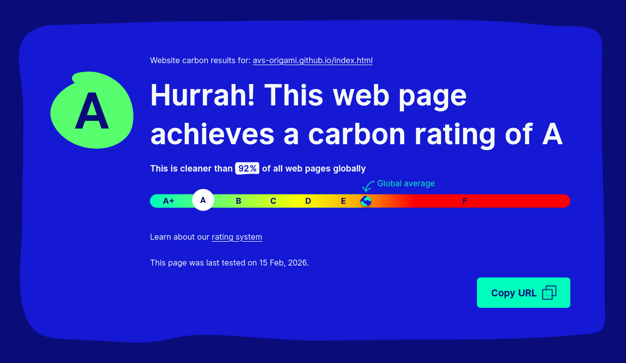
 And my profile picture is also way larger than it needs to be, so shrinking that
helped by another 5%.
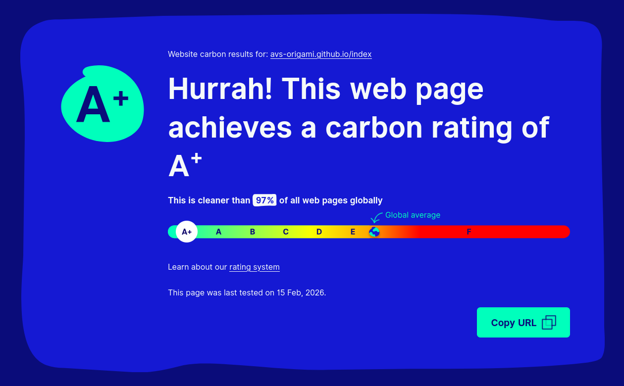
 That's probably good enough for now. Could be lighter, though. The website for
Tin Can Linux is at 100%.
<<< Go back Subscribe via RSS >>>
Adithya V. Sastry

Robotics + Origami
Creator of Tin Can Linux
Research Science Institute 2025
Lover of all things tiny

"A dream is not that which
you see while sleeping, it
is that which does not let
you sleep."

-- Dr. APJ Abdul Kalam


It looks a little weird on pages without much content, like the pixel art page and some of the easter eggs. Either there's a bunch of white space, or the columns are different heights.

I also felt weird having the updates section on the left, and eventually decided keeping an updates section was contributing to the clutter. So I ditched it completely and tried to set the whole thing to a fixed box region, like on some older or retro-style websites.
I need to move the whole thing down a bit though, and I also need to find a way to vertically center the left column content. Otherwise, if I were to size the body section to the left column's natural height, the body is much too short for my liking.
Then at some point, I thought it's just better to keep it really simple. Like the style of the Tin Can Linux website. So I stripped out the boxes, and the tiling pattern background, and muted the colors for bold and italic font. I also added a style for hovering over a link, which is probably much nicer visually than what I have now.
Something looks a bit off though. Can't tell what exactly. But I'm leaning towards taking some of the styles from this version and merging it with the box layout of the previous version. I could also come up with something completely different, so keep an eye out! Technical changes ----------------- Beyond the website style itself though, I've made more technical changes to keep the website actually lightweight -- in the sense of loading faster and downloading less stuff every time you click on a new page. These have actually been brought over to the version of the website you're looking at now. I'm using WebsiteCarbon as the metric for how lightweight my website is. Before messig with anything, it was sitting at a solid 80%.
I've added highlight.js to this site to colorize code blocks. I originally had pulled it from cdnjs, but that pulls in more than I need. After selecting the languages I actually use and storing it locally, it improved by 1%.
Not really worth it, but not terrible either. Next up: MathJAX. That's probably somewhat heavy. I swapped it out for KaTeX and it improved by 11%.
And my profile picture is also way larger than it needs to be, so shrinking that helped by another 5%.
That's probably good enough for now. Could be lighter, though. The website for Tin Can Linux is at 100%. <<< Go back Subscribe via RSS >>>
